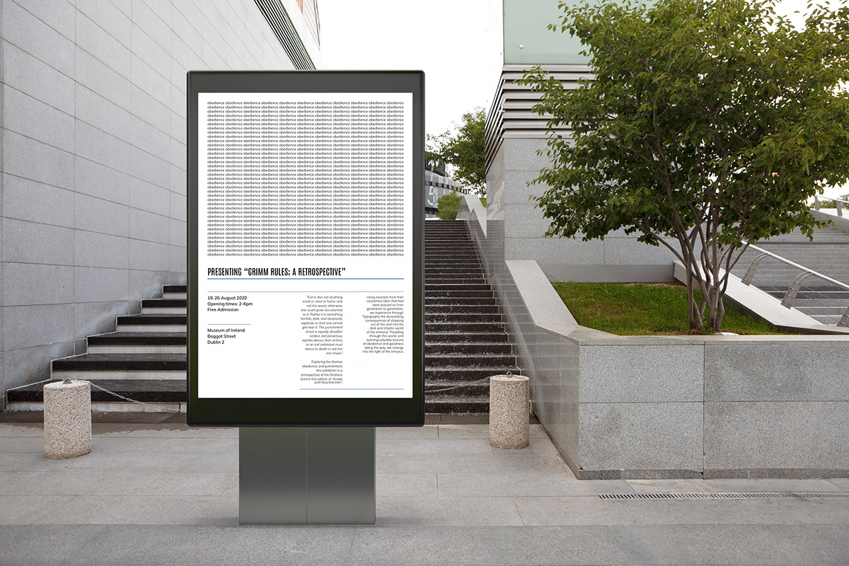
Brief: design a typographic based publication to support a retrospective exhibition of the Brothers’ Grimm, with accompanying supportive artefacts for both print and digital.
Solution: for this project, I decided to look at the Brothers’ Grimm first edition 1812 collection of tales and focused on the themes of rules, obedience and consequence. To typographically explore this I used the grid system and played with the rules of layout. Each story selected represents a different behaviour; 3 bad which break the grid, 1 redemptive that transforms into order, and 3 good that abide by the rules. The book goes from dark to light to represent the gradual learnings that the tales and their lessons provide the reader. Researching the grid system and its history informed my design direction which is inspired by Swiss Style, and designers like Karl Gerstner, El Lissitzky, Emil Ruder, Armin Hoffman and Rosemary Tissi. This project is something I want to revisit as I feel an opportunity to really explode creatively was missed. It was my first project entirely in lockdown so there was a huge adjustment there and I, unfortunately, wasn’t able to really give it my all. I loved this topic and idea so I’m excited to get it right next time.